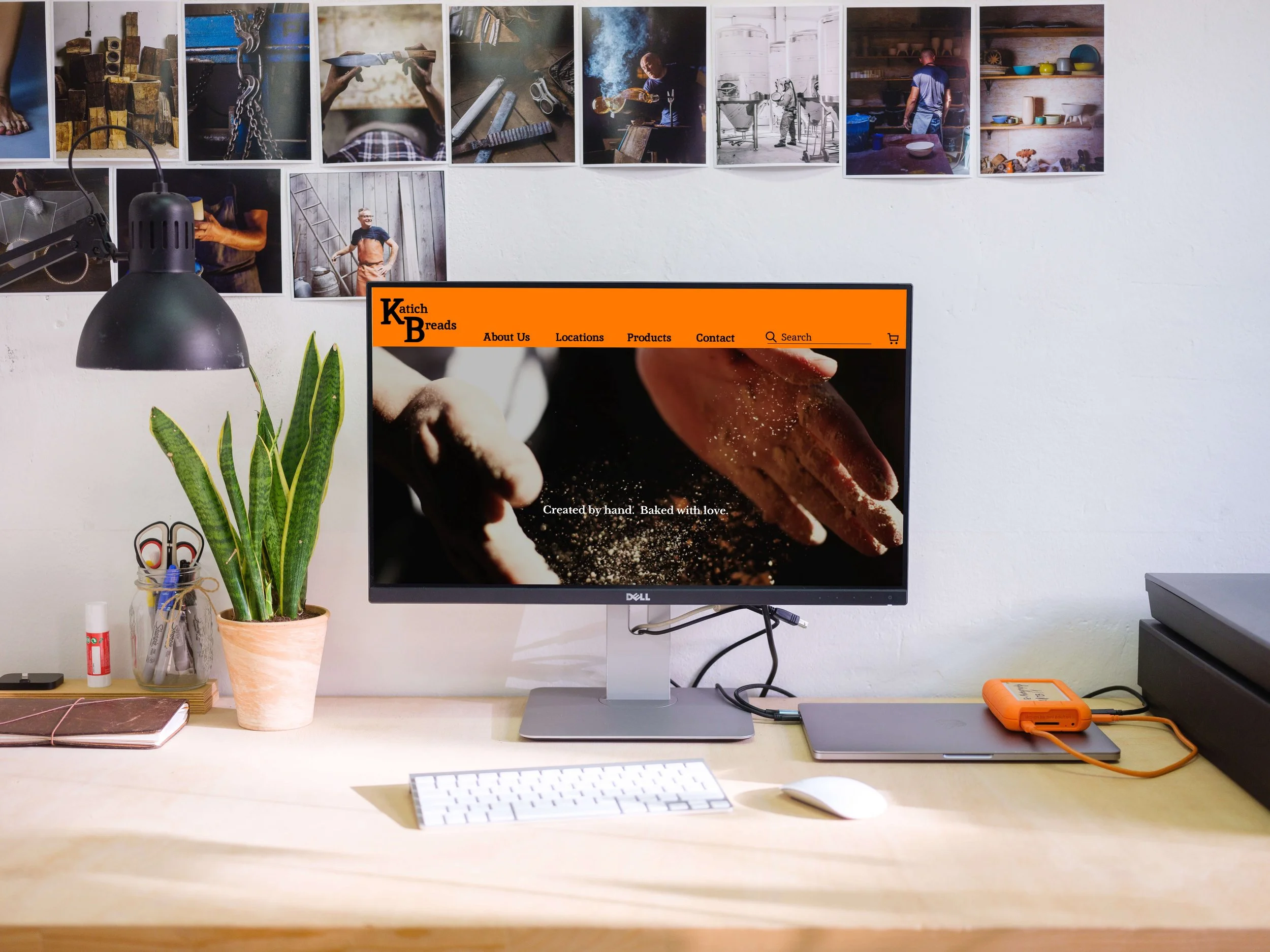
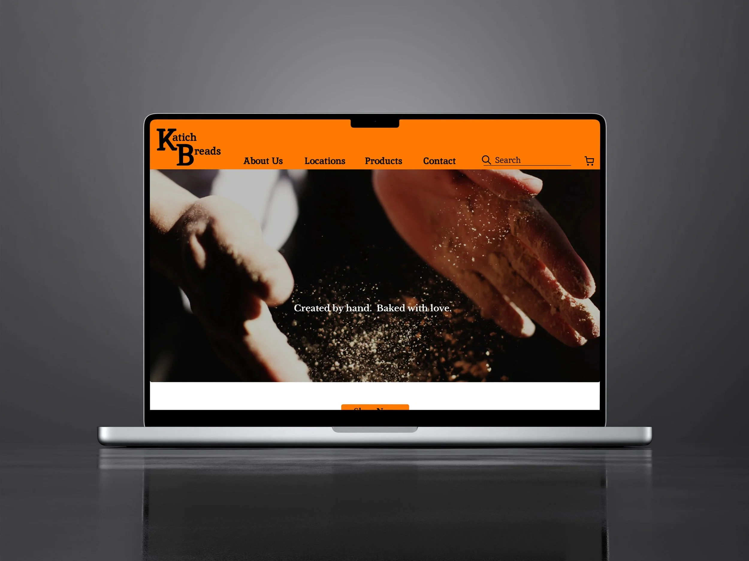
Katich Breads
A responsive website for a Chicago bread company
Duration: 3 Weeks
Role: UX/UI Designer + Brand Designer + Researcher
Project Type: Responsive Website
Tools: Figma, FigJam, and Zoom
Domain Area: Food Industry
What is Katich Breads?
Katich Breads is a web-based platform where consumers can order bread for pickup at their local Farmers Markets.
Background
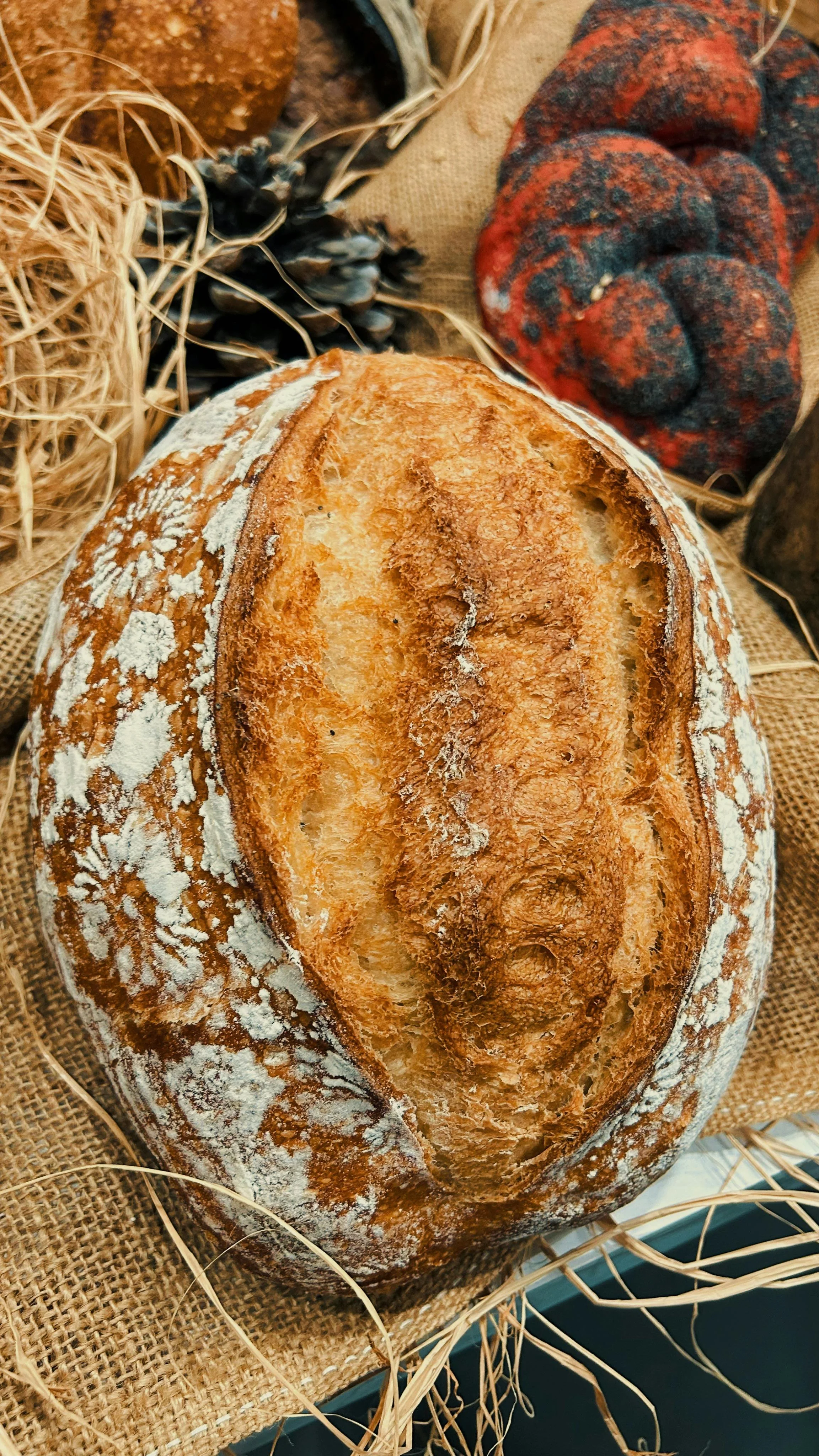
Katich Breads is a bread company based in Aurora, Illinois. They make a wide variety of artisan breads that ar freshly baked by their bakers. They are a company that does not have a storefront, but rather markets their breads online, and makes them available for pickup at over ten different Farmer’s Markets weekly. They rely heavily on their website for customers to place their orders.
The Problem
Katich Breads currently has a three page website that is very difficult to navigate and order products from.
The Website needs to be designed from the ground up to better illustrate the products the company has to offer its consumers. This way, customers can make informed decisions when researching and choosing which breads to purchase. Currently, it is very difficult to place orders which can lead to a negative customer experience and make ti hard to retain and gain new customers. To alleviate this problem, they need a website that contains clear, concise, and relevant information.
To address the problems, my proposed solution is to develop a new homepage design with a better layout, to design new site information architecture including navigation, and to design a new product listing page that will also offer an option to add items to the cart.
The Goal
The project goal was to design a responsive website that includes key pages to help the user make an informed decision when placing bread orders. Using research, I wanted to determine what users look for when choosing a bread company to purchase bread from, and how they can navigate through all of the different products and information. In doing so, the ultimate goal was to retain their customer base while continuing to grow their business.
This will be accomplished by:
Providing a more meaningful website to better represent who Katich Breads are and what they offer
Having an option to add items to the cart while looking at the products
Adding items to the cart, and then choosing a pickup location and date
Completing an easy checkout process
How might we create a user friendly website that helps users feel informed and make knowledgable decisions before placing their bread orders.
The Process
Through user interviews and competitive analysis, I found that there is an opportunity to improve this website and make it a responsive website as well. This will increase user retention and decrease user frustration.
The Conclusion
I designed and tested two key flows for this responsive design. The designs were rated highly in was of use, concept, and overall design. The participants thought it was very user-friendly, and that it would be very beneficial for current and future users of the website.
The Design Process
EMPATHIZE
Research Plan
Competitive Analysis
User Interviews
Interview Analysis
Affinity Mapping
DEFINE
User Personas
How-Might-We Statements
IDEATE
Feature Roadmap
Sitemap
User Flows
DESIGN
Low Fidelity Wireframes
Branding And UI Design
High Fidelity Wireframes
Prototype
TESTING
Usability Testing
Revisions
The Final Prototype
Empathize
Research Plan | Competitive Analysis | User Interviews | Interview Analysis | Affinity Mapping
User Research Goals
I wanted to learn what people look for when choosing a bread company to order from and what helps them make them decide on one company over another. I also wanted to find out what information would be relevant and important to include on the website so that users can make informed decisions.
We want to learn:
What customers want to see in a seamless shopping experience for a company that sells food items.
What challenges people face when ordering food items online.
User Research Objectives
I compared the features, strengths, and weaknesses of four food products companies: Highland Baking Company, 3D Baking Company, Turano Baking Company, and Publican Quality Bread. The research helped prepare me for user interviews by giving me a better understanding of what information is currently being offered by bread companies on their websites. I also began to gain a better understanding about what features were being offered and what features could be useful to have on a website. This also helped me to identify common strengths and weaknesses so that I could better understand what elements were needed or needed to be avoided when designing the website.
We want to understand:
Who the target consumers are
How the current consumer purchases food items online and what information they need before making a decision
Target Market: Most of the websites had a broad target market that could lend itself to a wide range of consumers.
Distribution: Most started as family owned businesses and have a store front location or sell their products at grocery stores.
Ordering Capabilities: Most of these companies seemed to only sell to major companies rather than individuals ordering their products
Competitive Analysis Insights
User Interviews
I conducted interviews with 5 participants who shop online for food items frequently:
All shoppers range in age from 30-65
All were asked questions focusing on five main categories
When buying food products online, what is the most important feature they look for
Do health and nutrition factor into their buying decisions
What information they need to know before ordering or making a purchase
What features they find beneficial on a website where they would order food products
What features they would need to see on a website where they would order food products
User Interview Analysis
User Goals and Motivations:
All participants would like a simple process of finding out information about a food item before purchasing
All participants would like to see pictures of the items before making a purchase
All participants would like an easy add to cart/ordering process when buying food items
4 out of 5 participants would like to see all the information on one screen
3 out of 5 participants would like a confirmation screen after purchasing
User Needs:
All participants needed to know the price, ingredients, and shelf life of items before purchasing them
All participants needed to know the delivery options before making a purchase
All participants wanted to know sourcing information before purchasing
All participants needed to know the ingredients in an item before making a purchase
3 out of 5 participants wanted to read reviews of items before making a purchase
2 out of 5 participants wanted to know where the item was coming from before making a purchase
2 out of 5 participants wanted contact information for the grower before making a purchase
User Frustration and Pain Points
All participants struggled to find a website where you order food with all the information on one screen
All participants were unable to find a simple format for finding ingredients, pictures, prices, and review
All participants were frustrated with how hard these websites are to navigation
3 out of 5 participants were frustrated with how difficult the ordering process can be
3 out of 5 participants were unable to toggle back and forth between pertinent information
“I am very health conscious and need to know the ingredients before making a food purchase online. ”
“I like to know where a product is sourced from before buying. ”
“Ingredients are very important to me, and I want an easy way to see and read them.”
Affinity Mapping
Using FigJam, I created an affinity map by sorting participant answers to find patterns. By doing that I was able to identify areas of common goals, common fears, and common frustrations.
Key Research Insights:
Consumers want a website that is easy to navigation
Consumers want to be able to find all necessary information easily
Consumers want an easy ordering and checkout process
The Big Takeaway
After analyzing the interview documentation, it was clear that having all product information in one place and an easy to navigate website were the most important things when designing a website for offering food products.
Define
User Personas | Point-of-View Statements | How-Might-We Questions
Building User Empathy
My competitive analysis and user interviews provided me with a better understanding of who my users are and what problems that they face. In an effort to turn my research findings into concrete visualizations, I created two key user personas to help me empathize with my users and understand their needs.
Personas
This is Jane
As I reviewed the research findings, some very clear patterns emerged. I was able to create this primary user persona, Jane, by identifying the common goals, motivations, and frustrations among my interview participants’ answers. Jane represents a busy working wife living in Chicago. She loves hosting dinner parties, but doesn’t have the time to sift through websites that are hard to navigate in order to find all the information about new products she wants to try out at her parties.
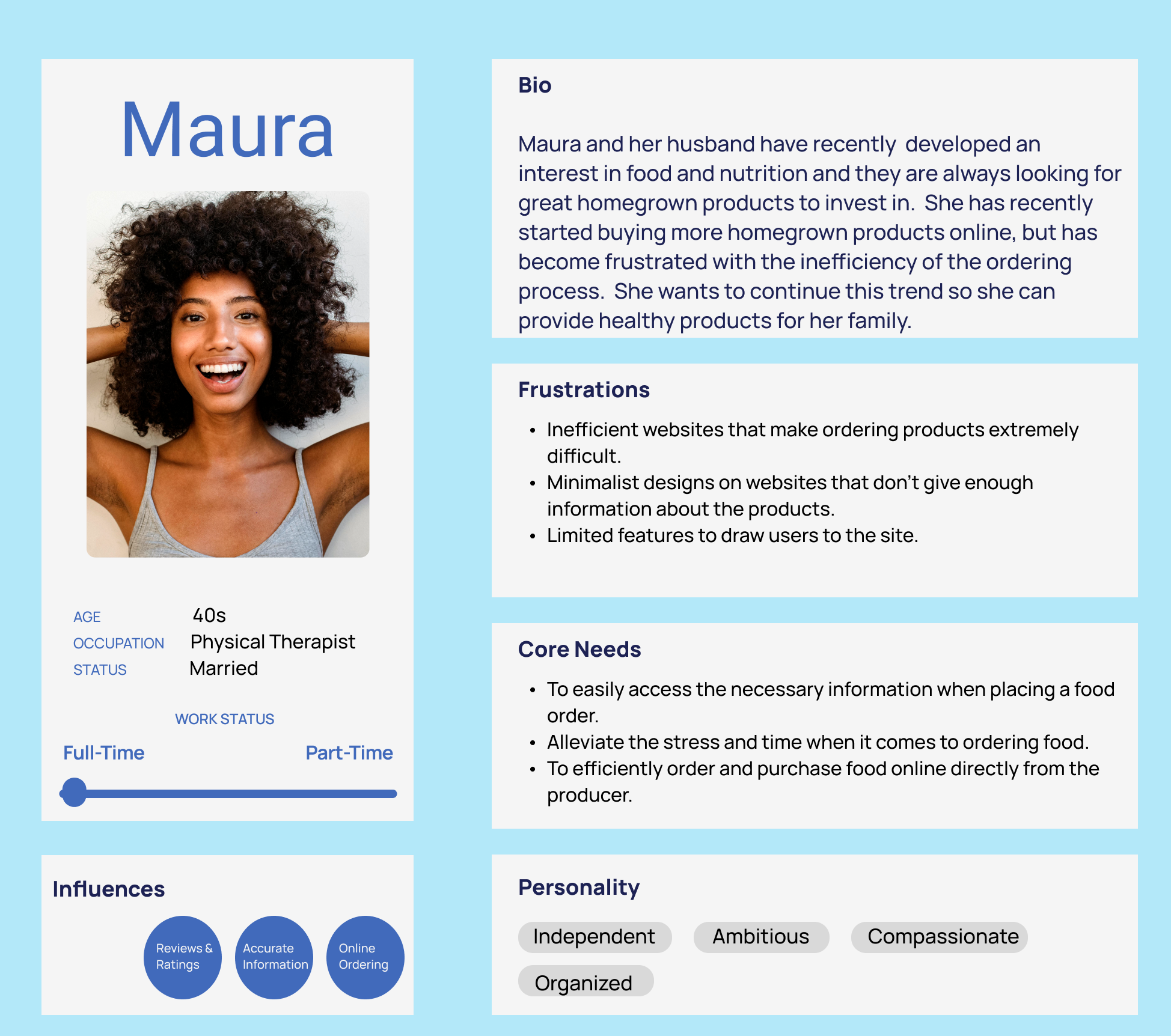
This is Maura
Maura is a working wife who has recently become very health conscious about the ingredients in her foods. She has become frustrated with the difficulty in the ordering process on many websites. She is looking for a website that is easy to use and doesn’t take up so much of her time.
POV & How-Might-We
Now that I could visualize my users and empathize with their problems, I wanted to create point-of-view statements and how-might-we questions that would help me to clarify the key problems and focus on designing a website to meet my user’s needs.
I would like to explore ways:
To offer users a less tedious and frustrating process for ordering bread online.
For Katich Breads to keep their brand values at the forefront while modernizing and elevating their website for future visitors.
To streamline the ordering process while giving the customer all of the necessary information.
How Might We:
Find an easy and efficient way to order bread from Katich Breads online.
Redesign Katich Breads’ website to be more user friendly and modern while still displaying their values.
Streamline the ordering process for Katich Breads while still giving the customer all of the necessary information.
Ideate
Feature Roadmap | User Flows
Feature Roadmap
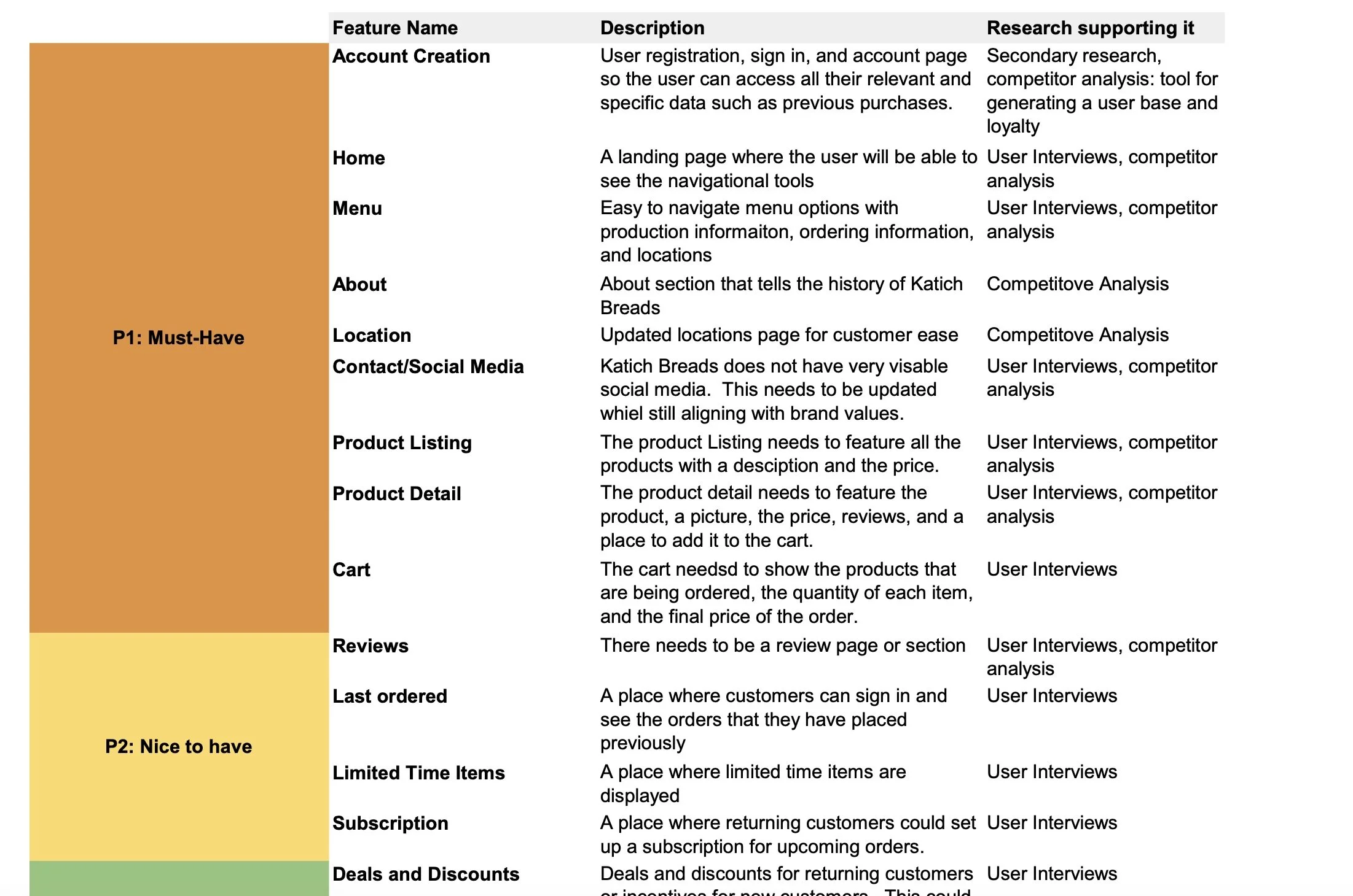
I used the research findings to determine the most important features to include on the website, as well as features that would be nice to have and features that could come later. I divided the features into four main categories to determine which features must be included when I started designing.
Must-have features:
Account Creation
Home
Menu
About
Contact/Social Media
Product Listing
Product Details
Cart
Nice-to-have features:
Reviews
Last Ordered
Limited Time Items
Subscription
Surprising and delightful:
Deals and Discounts
Calendar of Upcoming Events
Can come later features:
Ingredients that Stand Apart
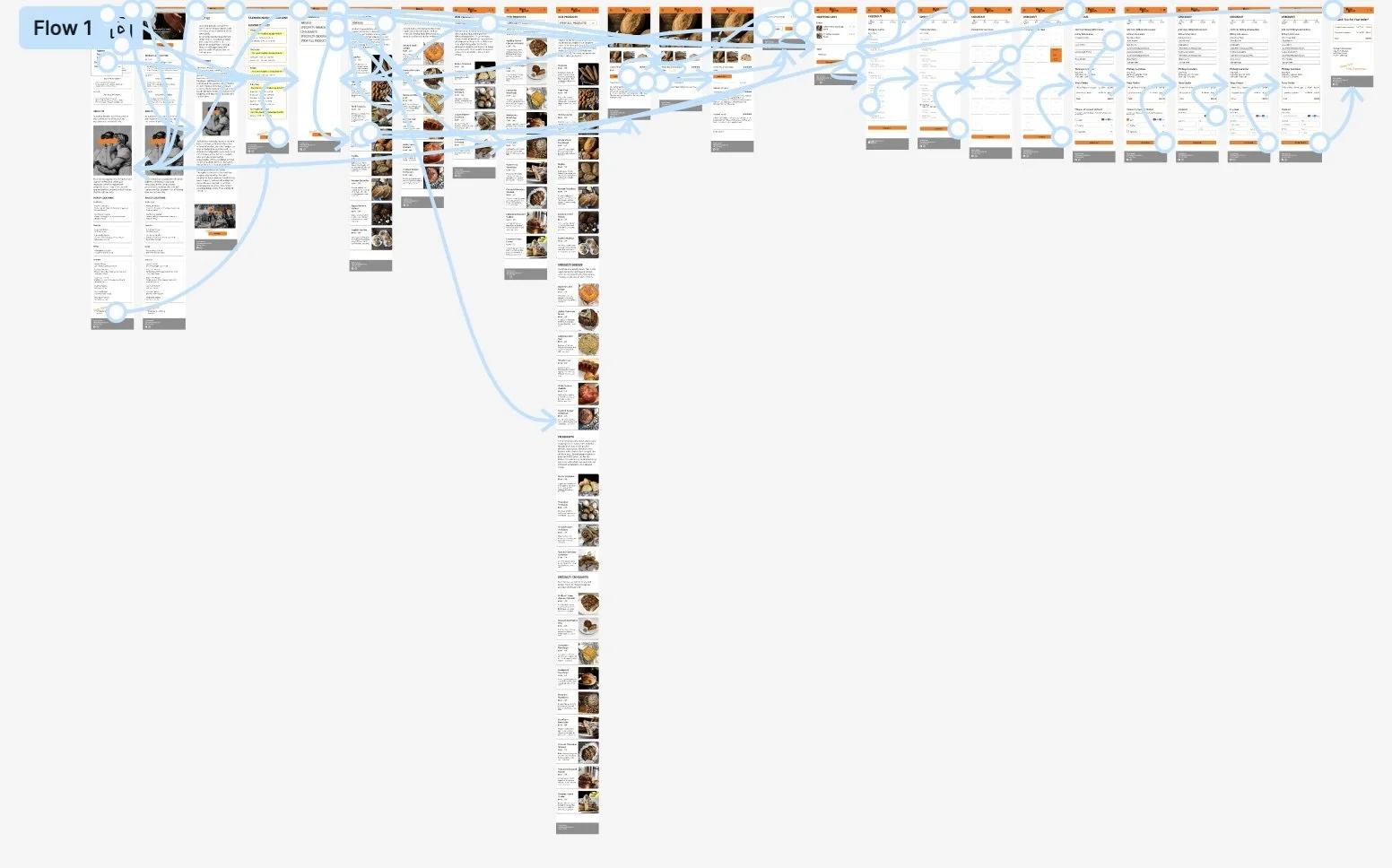
User Flows
The user flow outlines the user’s journey throughout the website. It also showed me what actions they would take if confronted with any potential roadblocks.
Design
Low Fidelity Wireframes | High Fidelity Wireframes | Prototype
Low Fidelity Wireframes
Based on the user flow and feature roadmap requirements, I created low-fidelity wireframes. I used Figma to create my wireframes with examples of pages for about us, locations, products, and a contact us page. I designed most of my screens in mobile as that seems like the most common use of this website. I also designed a few key screens for desktop as well.
High Fidelity Wireframes
Using the low fidelity wireframes as a guide, I created high fidelity versions of each page. Although the layout and site hierarchy were complete, I still had to determine the specific content for each page which was challenging. I had to keep in mind the research that I did, to make it simple to use and user-friendly.
Prototype
I created interactive prototypes in Figma to test user flows. I wanted to test the overall site structure to understand how users would navigate the site, as well as test specific user flows to identify any areas of weakness for accessing specific information.
Note: This prototype includes the priority revisions that were made after the usability tests were conducted
Usability Testing
Test and Iterate
Usability Testing | Revisions | The Final Prototype
I conducted a usability test with five participants in order to evaluate the ease of use, navigation through the site, the ordering and checkout process, and to identify any usability issues with the site. I wanted to understand the users overall experience with the site, and to gather any final thoughts about it. I wanted to make sure that I received enough feedback for any final revisions that would be needed.
Participants were asked to complete the following tasks:
Click on the hamburger menu to view the location and products
View the different products
View the breads
Click on the sourdough bread and look at the product information, ingredients, and reviews
Place an order and complete the checkout process
Success was measured by the following tasks:
Task success rate
Time to complete each task
Ease of use
User satisfaction
Overall design and aesthetics
Testing Insights:
The biggest takeaway was that everyone was confused about the location of the markets and the order deadline not being visible enough
I also determined that due to the ambiguity of the word “location”, it should be renamed to something that would better clarify the location, therefore, that navigation item was renamed to “Farmers Markets”
All users successfully completed the tasks without error
Feedback was overwhelmingly positive; users appreciated how user friendly the website was
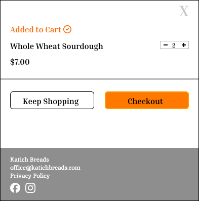
Users loved how easy it was to add items to their cart
Users loved how easy it was to view all information about specific products
Priority Revisions
Based on the usability test results, I made the following revisions:
General Changes:
Title was changed from Locations to Farmers Market Locations
Markets was changed to Farmers Markets
Pre-Order deadline is highlighted for better visibility
An Orange box was placed around the whole day and location
A remove option was added in the cart
Before
After
The Final Prototype
After extensive research, design, user testing, and iterations, Katich Breads’ responsive website is ready! The final prototype has been built and is ready to view!
Final Thoughts
Having a broad research pool made a big difference in the research process and gaining insights from experiences, pain points, and wants from a website like this one
Using existing design patterns was a huge time save, especially when trying to meet deadlines
Organization is key
Creating a timeline at the beginning of a project is key to making sure that everything is completed in a timely manner
Getting feedback from multiple people during different stages of the design process is extremely important
View More Projects
The Actor’s Daily Discipline
The Actor's Daily Discipline
End-to-End Application
Virtual Try On Assistant
Add A Feature


